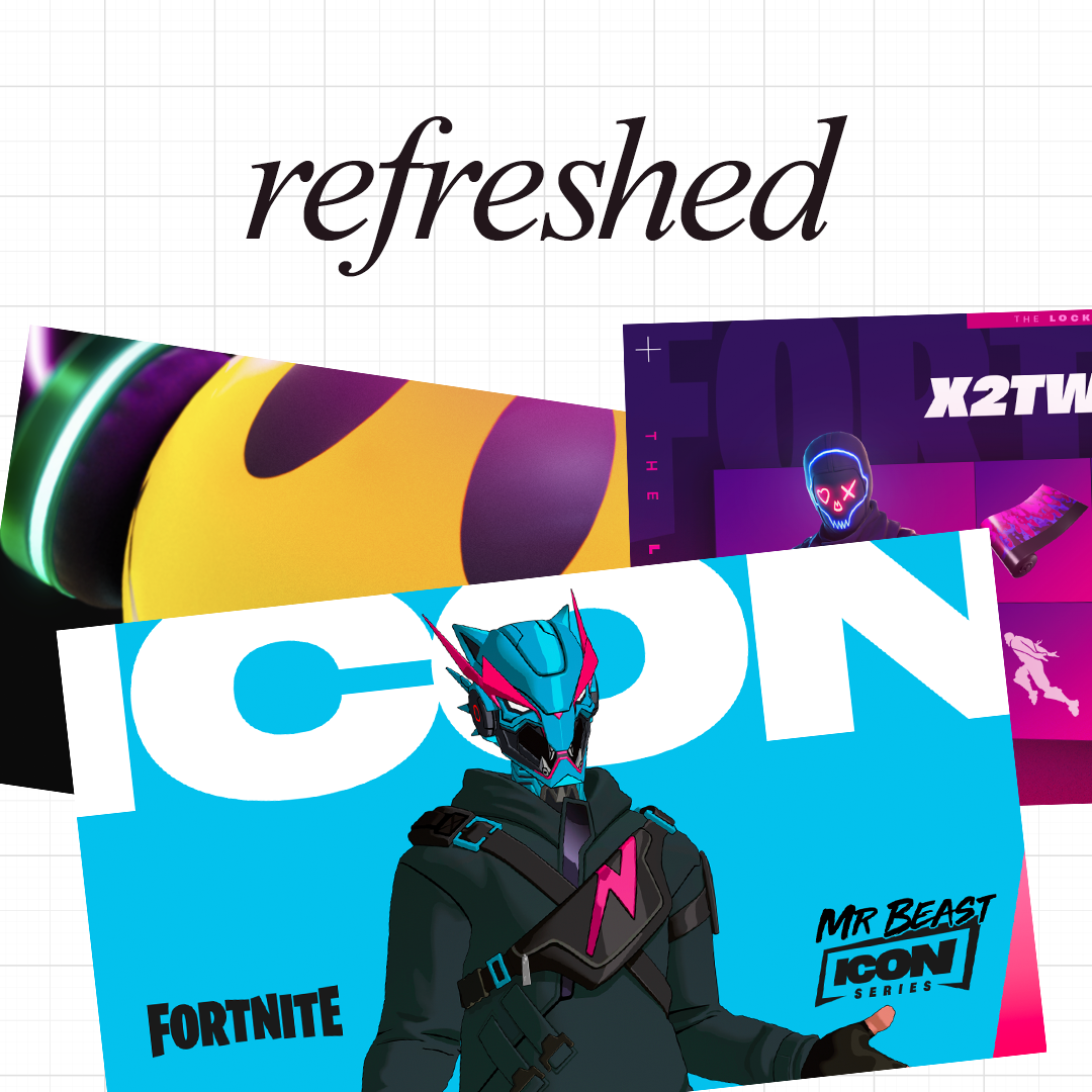
Refreshed
These recurring Fortnite programs, like Icon Series and Locker Bundles, were originally launched during the height of Battle Royale’s rise. Over time, they’d been handled by different designers, which left them feeling inconsistent and a little scattered. I stepped in to overhaul the templates, creating a refreshed system that gave each program a clear identity while keeping everything cohesive and easy to scale.
Credits:
Design Director: Dan Clark
Senior Designer: Britt Webb
Senior Designer: Ricky Linn
––
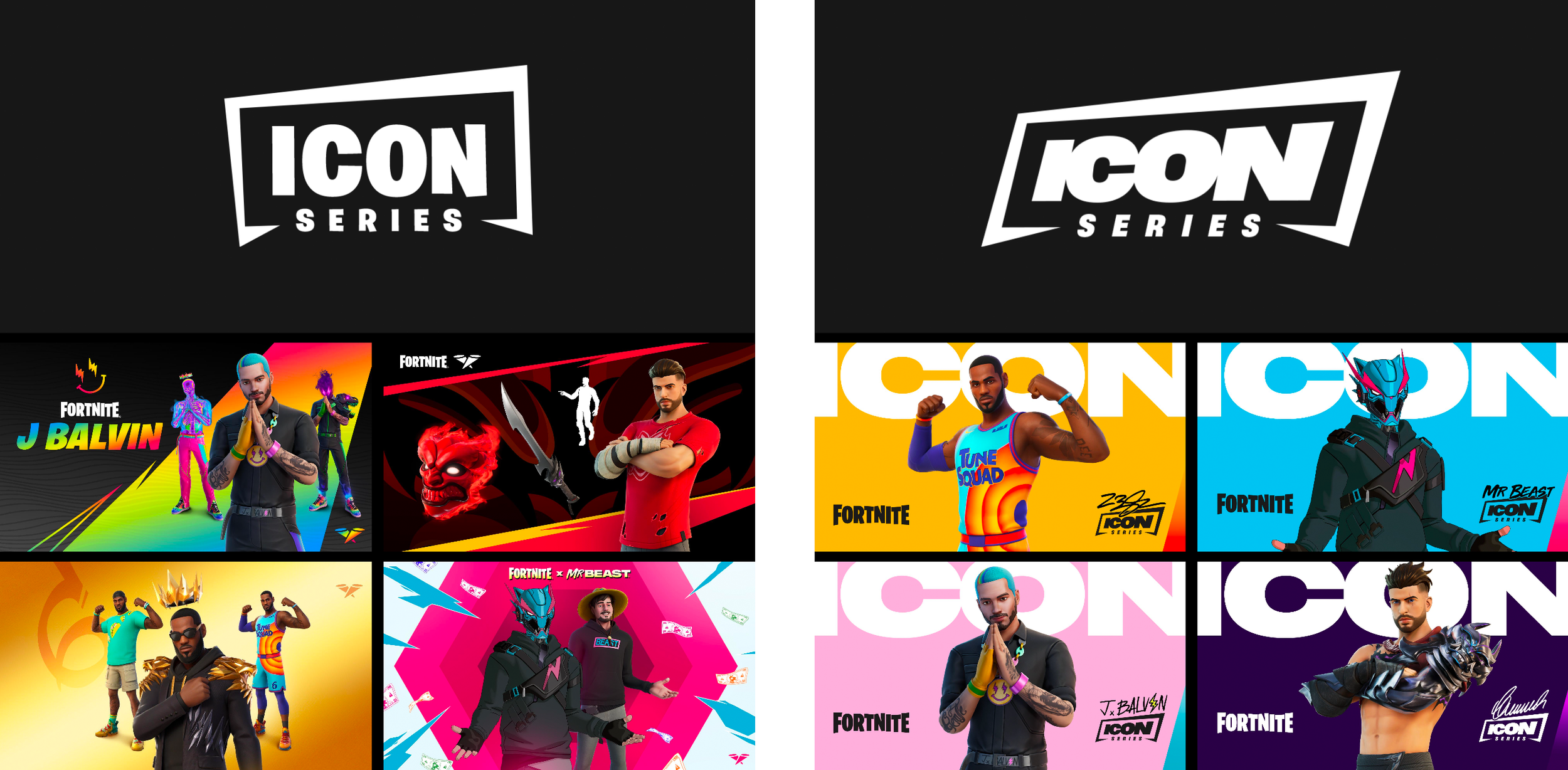
Icon Series (Before and After)
The Icon Series had become visually inconsistent, so I led a refresh to sharpen its identity. The updated logo and bold, simplified system brought clarity and maturity to the brand. Inspired by the bold confidence of a Wheaties cereal box, the new look gives each celebrity their own spotlight while standing apart from the noise of Fortnite’s broader social content.

––
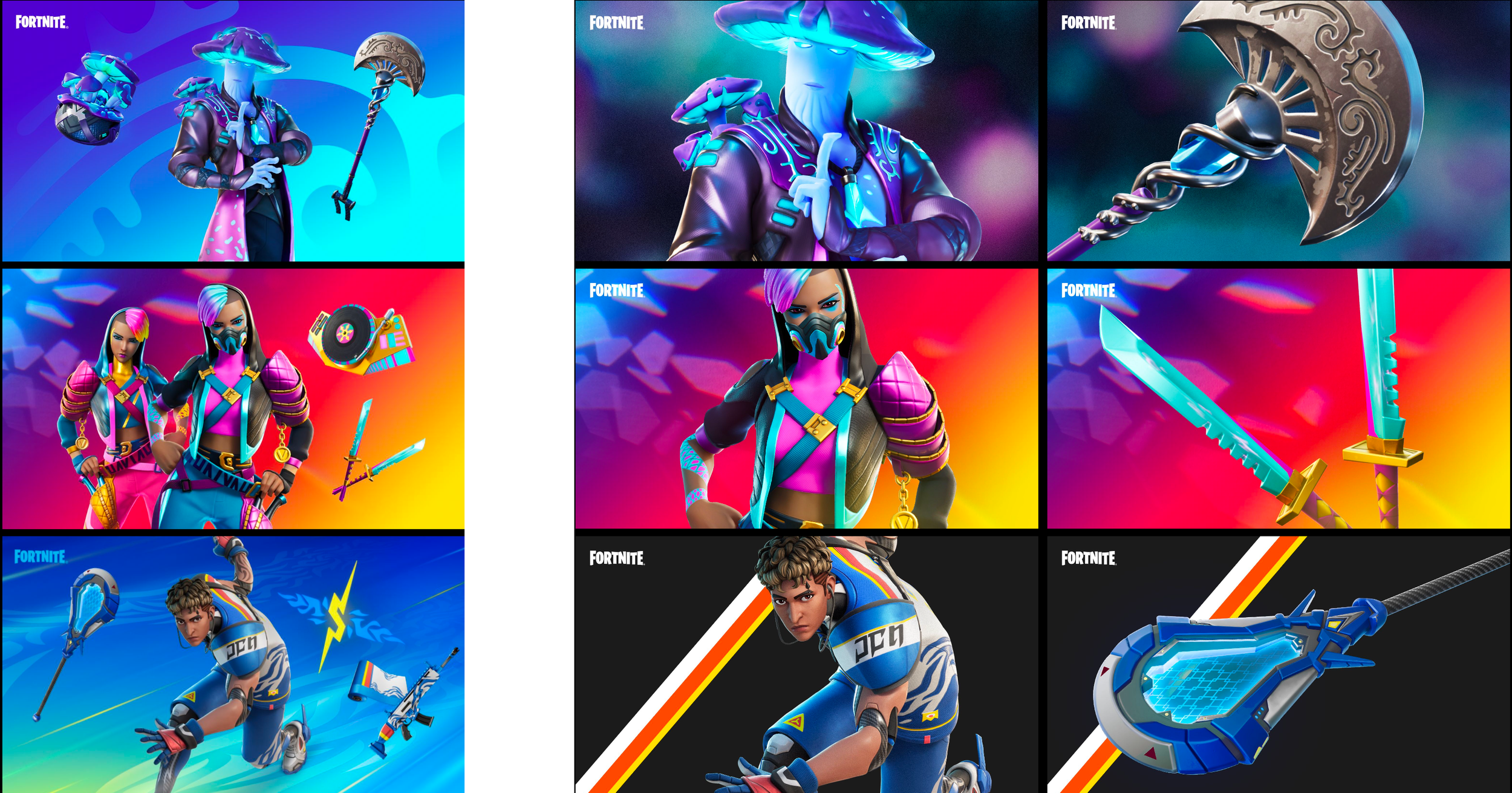
Item Shop Social Posts (Before and After)
These posts highlight new cosmetics available in Fortnite’s Item Shop. The original layouts felt cluttered, so I introduced a more editorial approach with closer crops, focused compositions, and a cleaner visual tone. The result felt more mature, aspirational, and product-driven.
––
Editorial Post concept
Applying the same editorial approach from the Item Shop refresh, I reimagined the Coachella collaboration with tighter crops and bold, detail-focused compositions. The goal was to make the campaign feel more fashion-forward, aspirational, and visually confident.


––
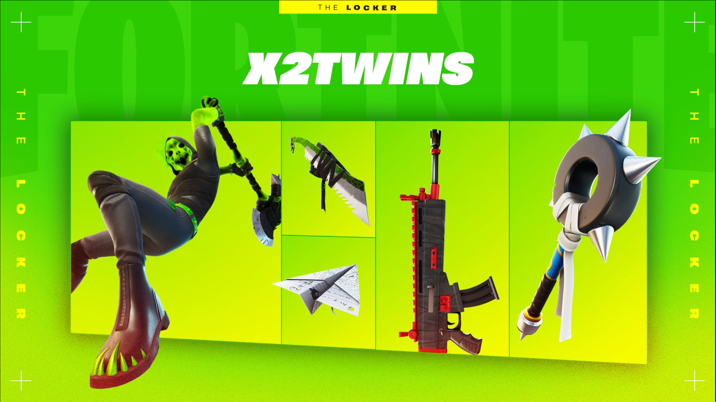
Locker Bundles
The Locker Bundle program invited creators and celebrities to curate their favorite Fortnite items into personalized collections. The early visuals were treated as one-offs, so I led a refresh to give the program a stronger identity. The new design emphasized bold grids, dimensional layouts, and clear program branding—creating a look that felt bigger, more cohesive, and instantly recognizable.


––
Editorial Post concept
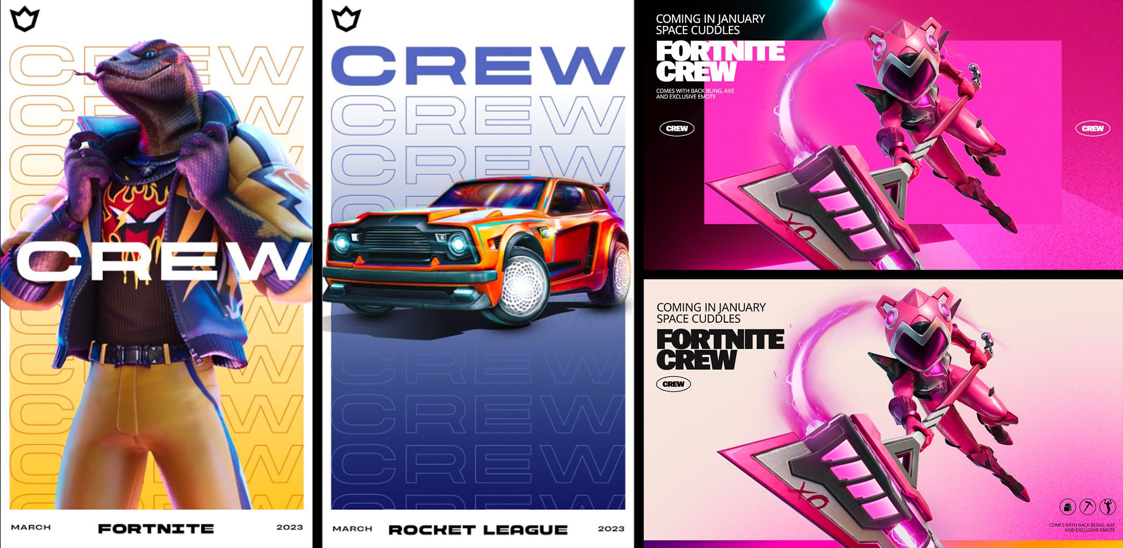
Fortnite Crew is a monthly subscription offering exclusive skins, perks, and the Battle Pass. We aimed to evolve its identity to feel more mature and brand-driven, drawing inspiration from streetwear labels like Kith, Nike, and Supreme. The result is a cleaner, more understated system that feels premium and fashion-inspired.